Copernicus Marine Service Data
This is a short presentation about what I have learned so far exploring the Copernicus Marine Service Website. As I have browsed the Jupyter notebooks provided by the Copernicus Marine Service, I learned a lot about data analysis, visualisation and how to interpret data. I learned about the different options for data manipulation. I also explored data analysis tools such as Pandas and Matplotlib. By using the Jupyter notebooks, I was able to gain insight into the different types of data, how to interpret them and how to visualise them.
Link to my JupyterNotebook: https://github.com/Leonieen/Projects/blob/main/CopernicusMarineService/CopernicusMarineService.ipynb
Data I used:
Python
Keywords:
Matplotlib
JupyterNotebook
Data visualization
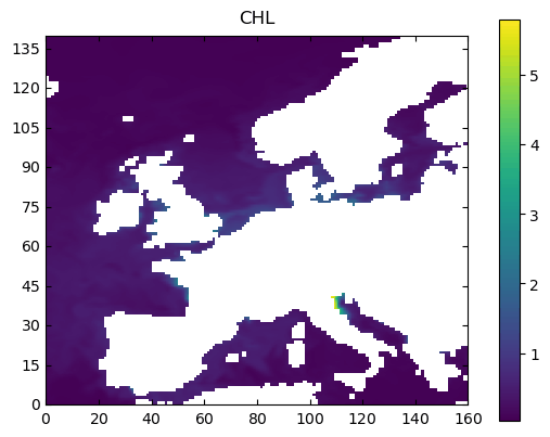
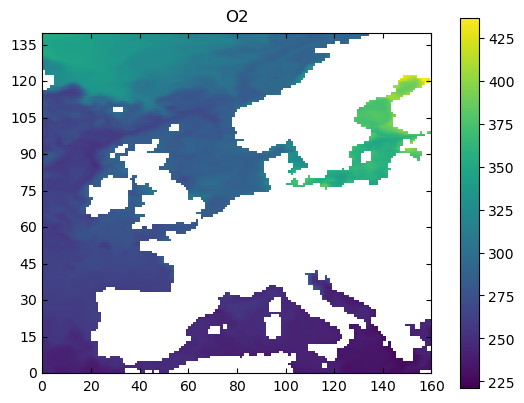
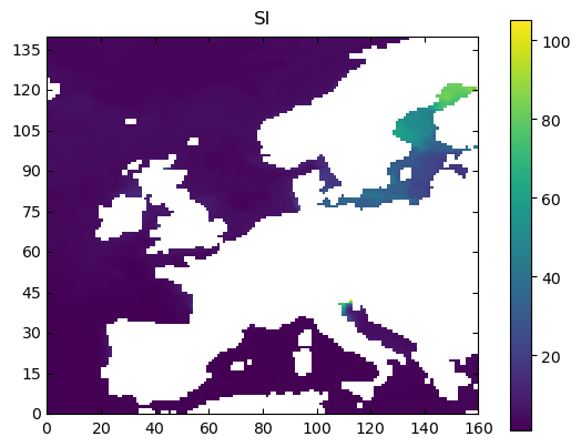
Global Ocean Biogeochemistry Variables
The ocean is an integral part of the global system and its biogeochemistry is a key factor in understanding climate change. Here I tried to visualize global ocean biogeochemistry data from the Copernicus Marine Service using Python and Matplotlib. Using these tools, it is possible to explore the various properties of the oceans and how they are being influenced by various climate-related processes. By understanding how the ocean biogeochemistry is changing, we can better comprehend how global climate change is affecting the world's oceans.


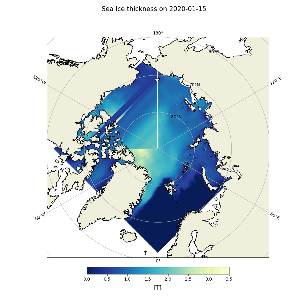
Arctic Ice Thickness
The Arctic ice pack provides an important piece to the global climate puzzle. Its thickness and coverage varies from season to season and year to year, but since the mid-1970s, has seen a steady decrease overall. This decrease for the past years has been documented using data from the Copernicus Marine Service. By visualizing this data with Python and Matplotlib, it is possible to get a better idea of how the Arctic ice pack has changed over time. Here is an example for the year 2020:


Sea Salinity and Temperature
The Arctic Ocean is a fascinating environment, with temperatures and salinity levels that vary dramatically over time. Here are some visualizations of the sea salinity and sea temperature at differnet locations and how they change with depth:


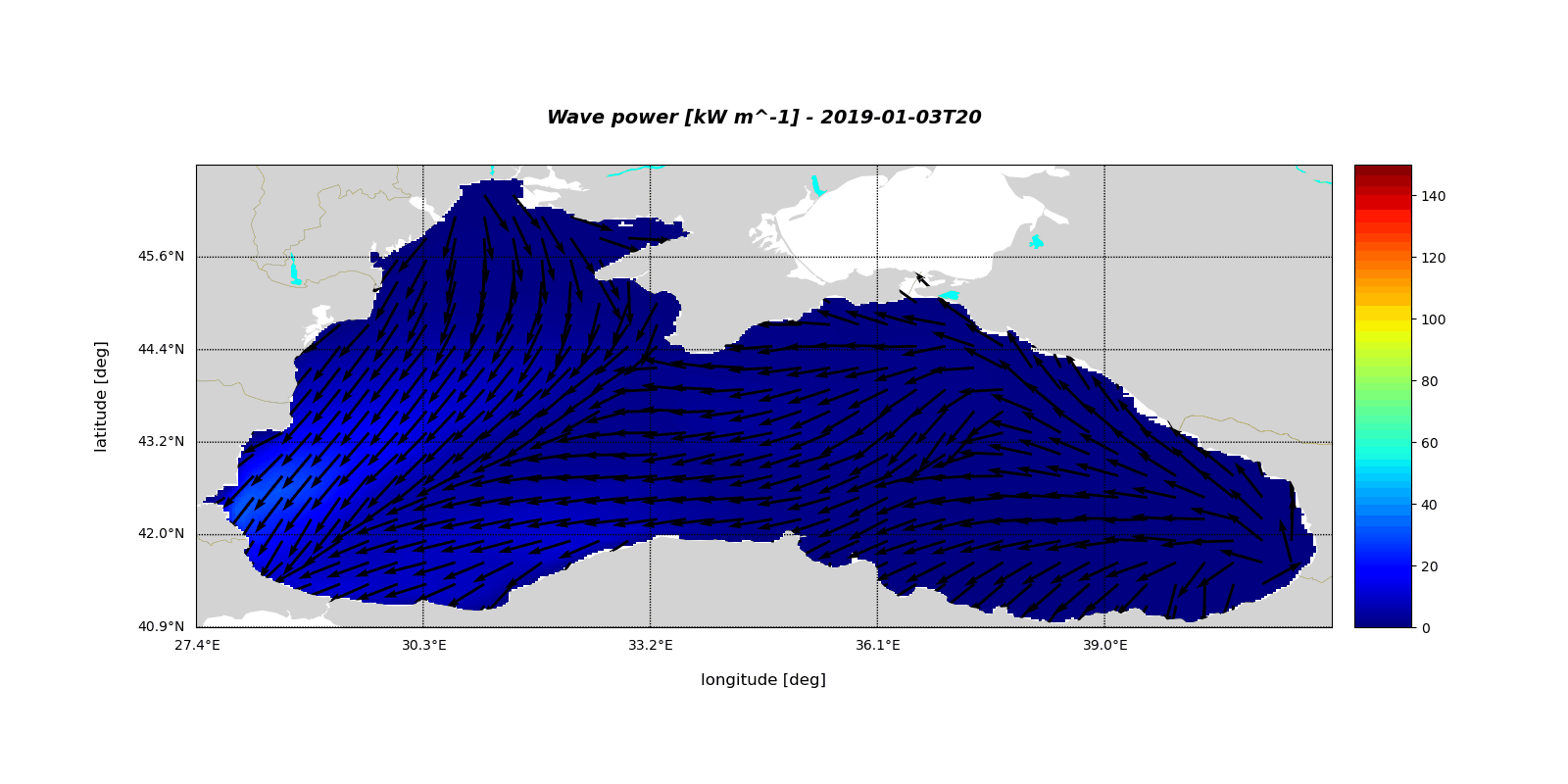
Wave Visualizations
Here is a demonstration on how to produce exemplary visualizations of wave data in Python and Matplotlib:
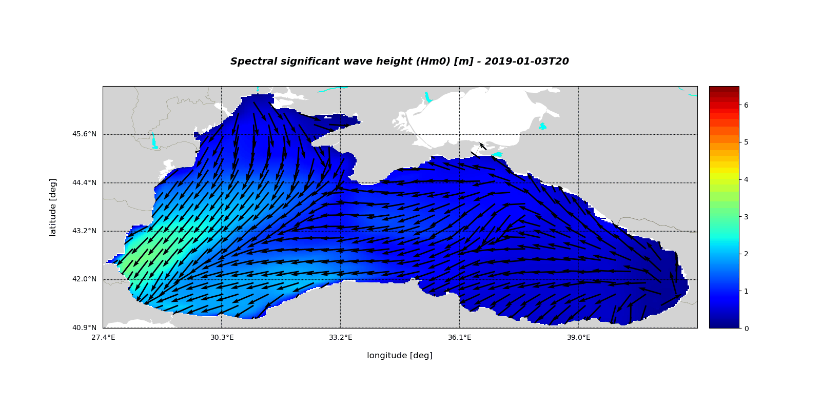


Waves


![Wave_power_[kW_m^-1]_-_2019-01-04T20.png](https://static.wixstatic.com/media/4f6d2d_eb477826b5f945dbbb8e2914d8fb45ed~mv2.png/v1/fit/w_1600,h_800,q_90,enc_avif,quality_auto/4f6d2d_eb477826b5f945dbbb8e2914d8fb45ed~mv2.png)
